


War Child Secret 7” was a brief presented by D&AD With the aim of creating an anonymous seven inch vinyl cover for one of seven tracks provided. The cover needed to be anonymous as the chosen cover was to be auctioned off.
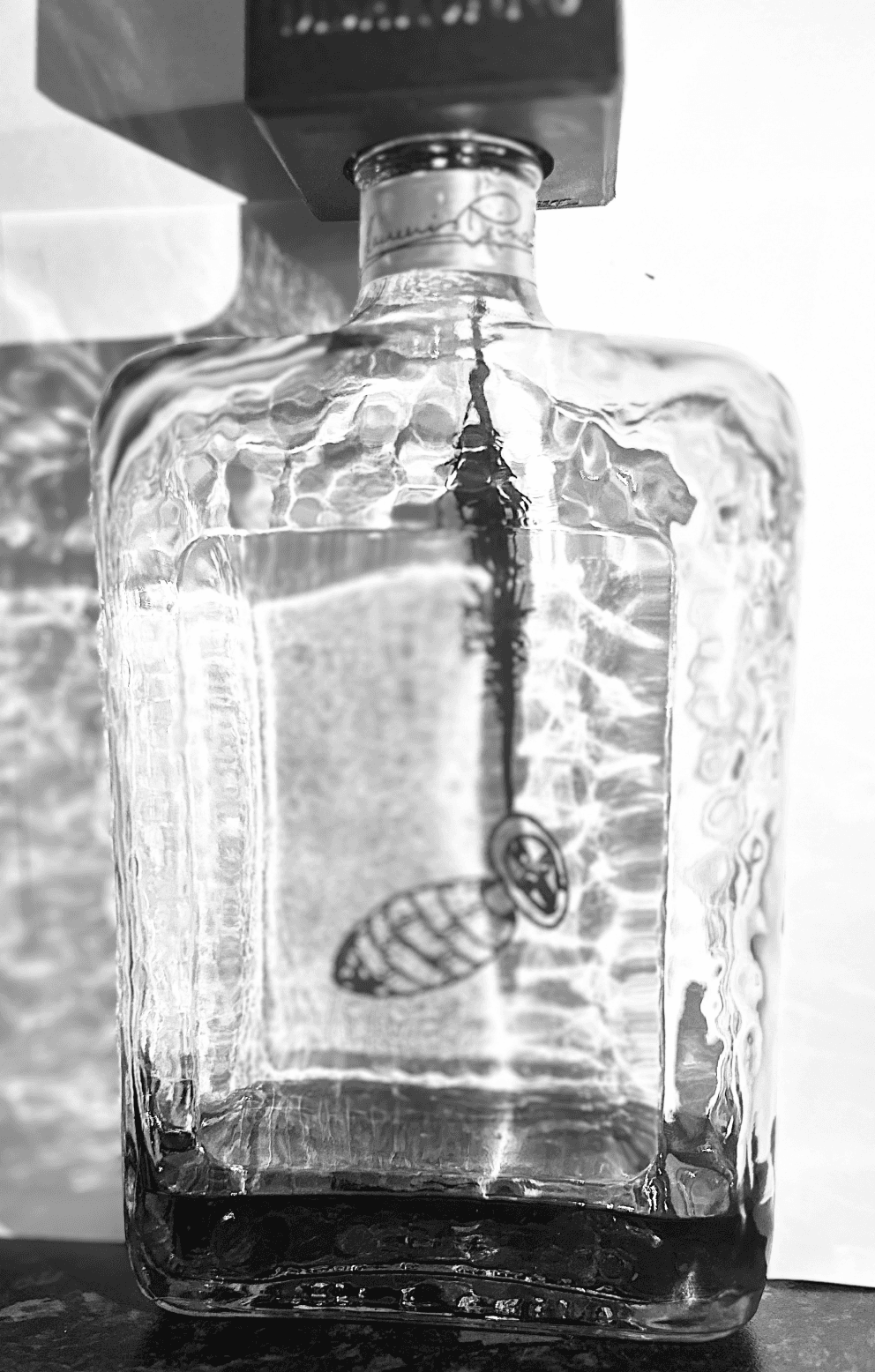
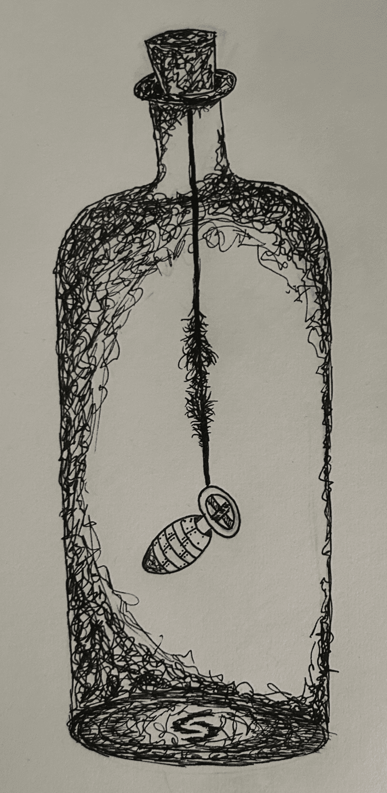
My Chosen track was Warsong by The Cure as im familiar with some of their other music. I decided to depict This song through a drawing of a bomb in a bottle as from a media perspective war seems like a contained thing in today's society.
I then decided to further this by recreating my drawing using an actual bottle to create the look that the bombs in the bottle as well as giving great textures from the light refracting through the glass.
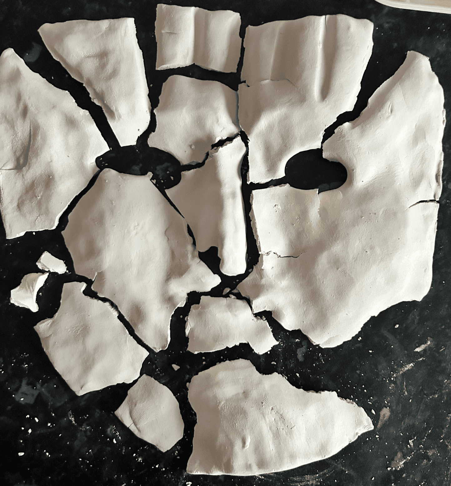
Following this I reflected on some of my research where I decided to implement a shattered clay mask as a response to the idea that through media war seems contained when in reality it is a matter that effects the masses regardless.

D&AD WarChild secret 7

Gallery

Taste
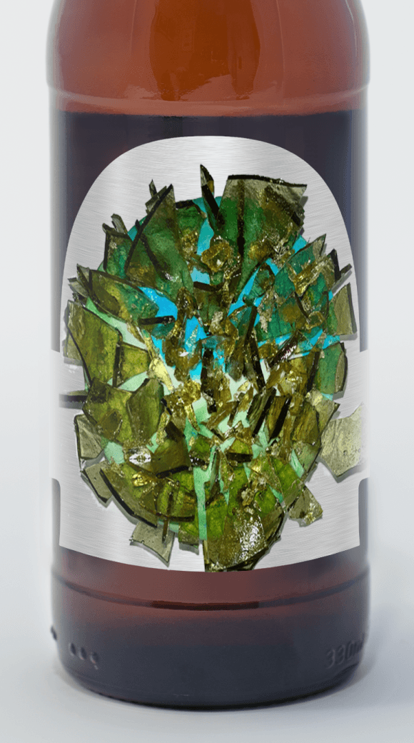
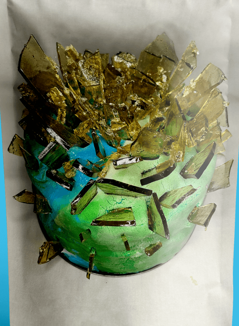
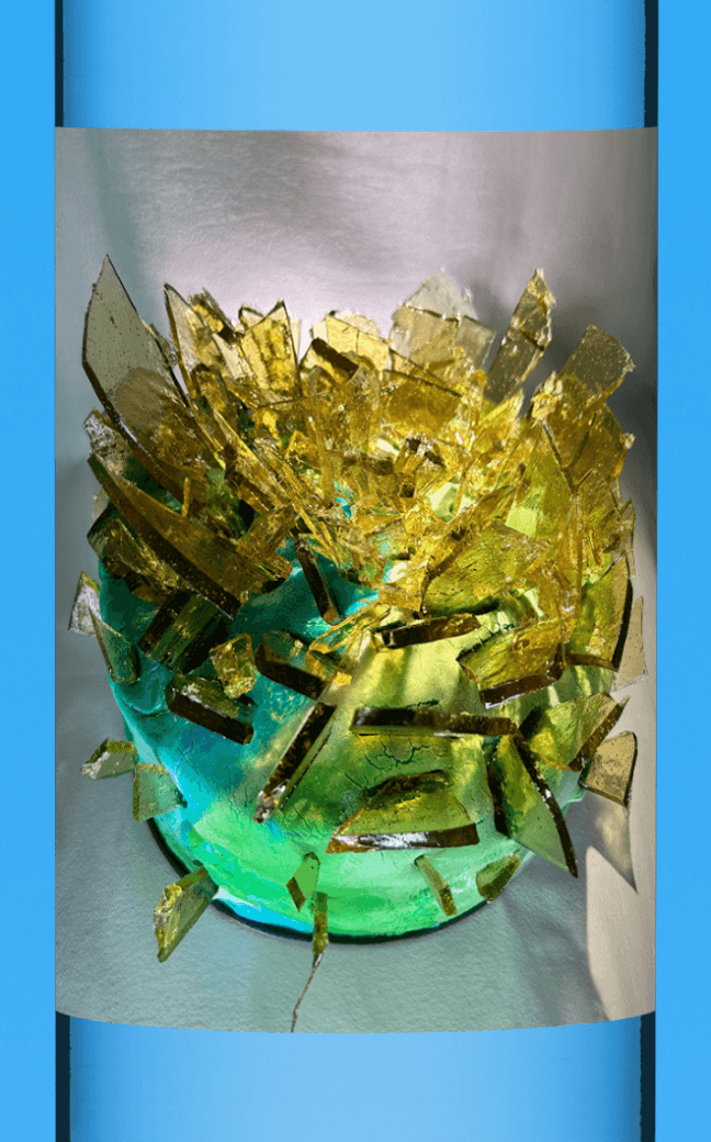
The Taste brief was about depicting specific tastes such as sweet or sour through visual methods. I chose to depict a sour taste through the means of a cake by using colours such as greens and blues which are typically the colours of sour sweets. I also decided to create some yellow sugar glass and smash it so that I could use the sharp and jagged edges of the glass to help emphasize the sharpness that comes with sour tasting things.
Gallery
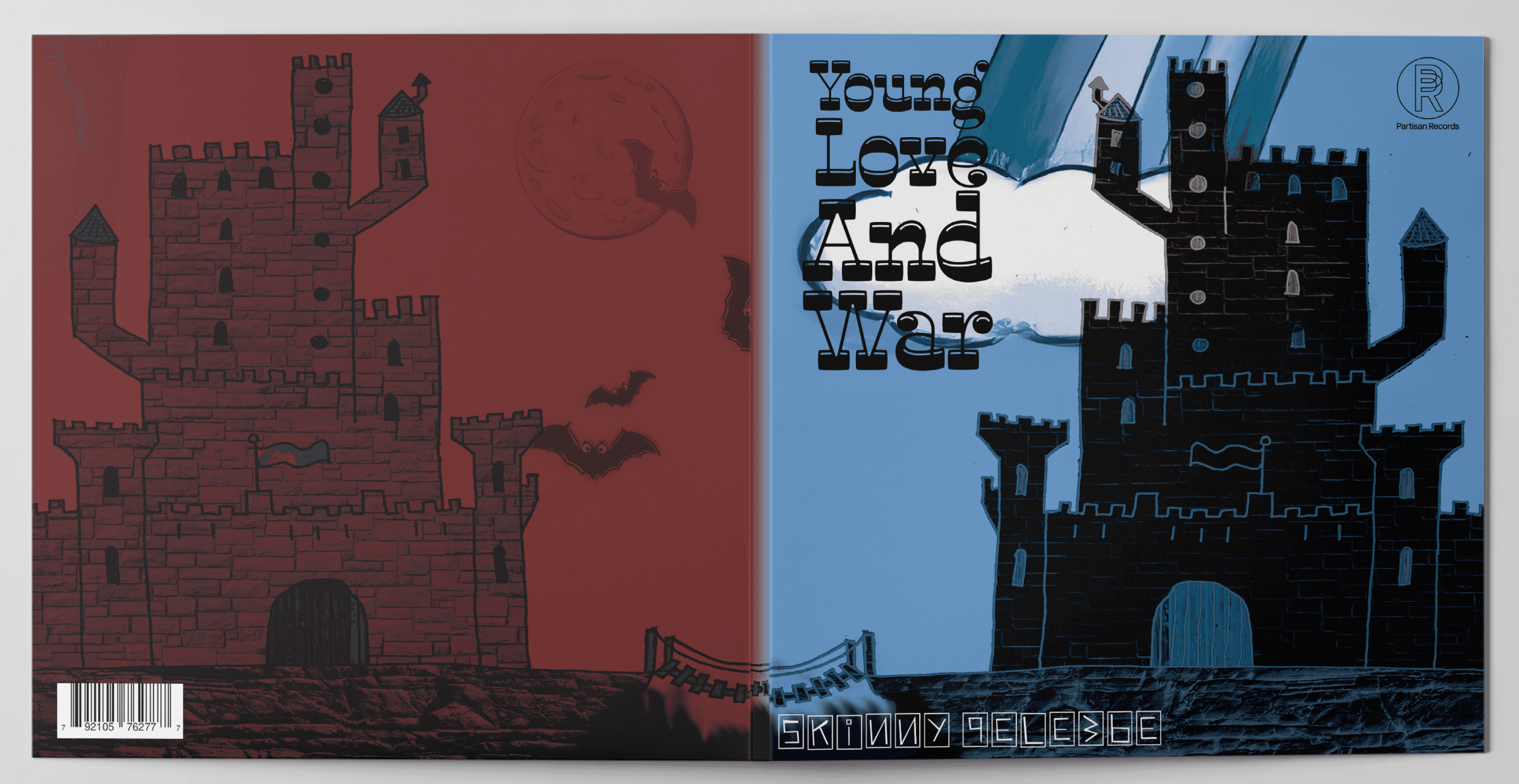
Skinny Pelembe Pt2
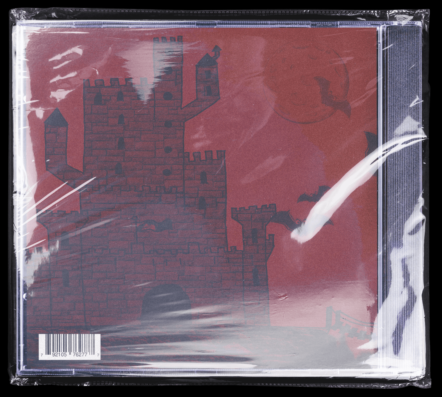
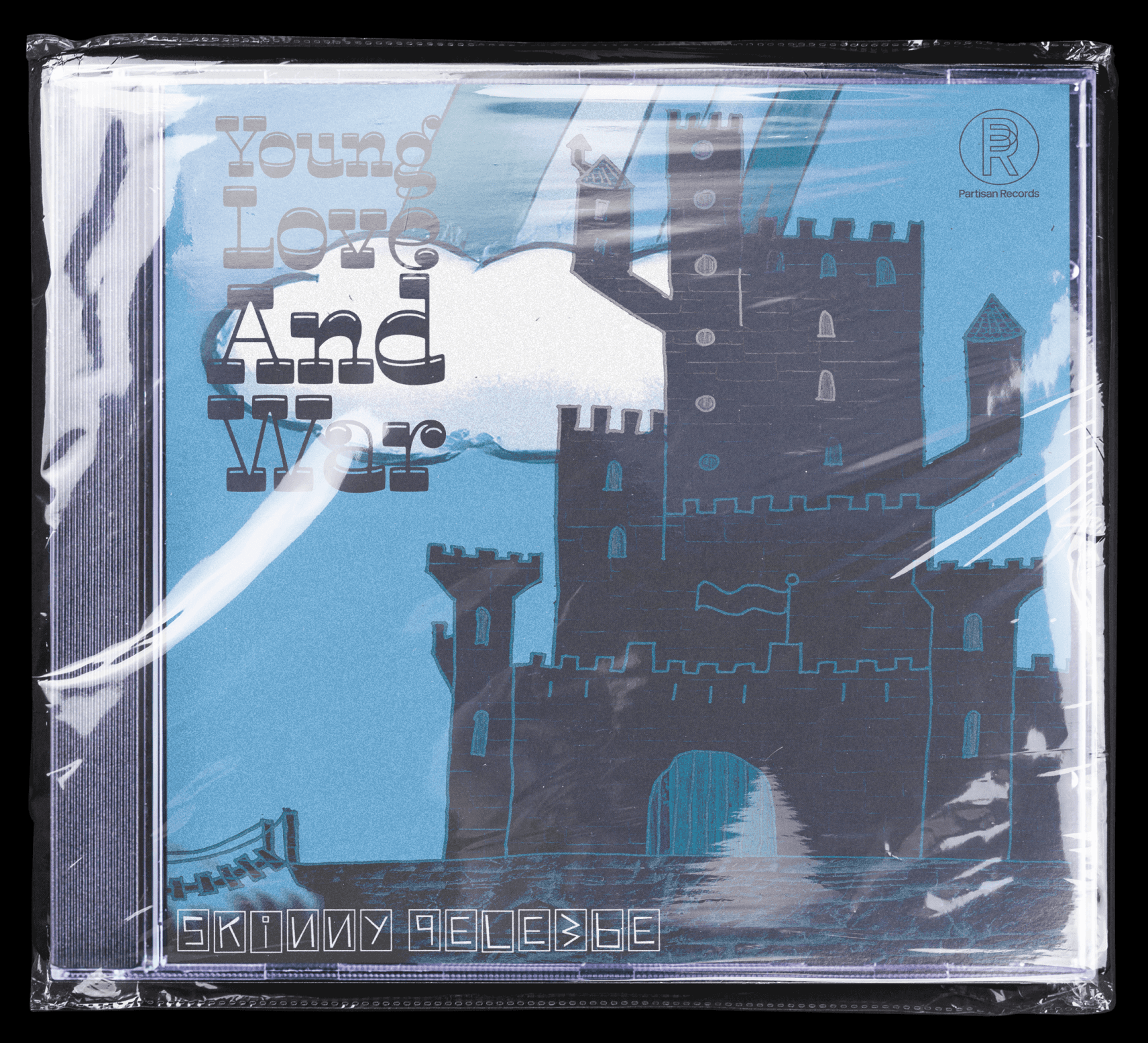
This project was an added deliverable to the Skinny Pelembe project where I was asked to zoom in on one track from the album and create the album artwork for it as well as the packaging.
From listening to the track I got the sense that this was a more emotional track and reminded me of some difficult relationships in the past.
Based on this insight I created imagery that depicted a fairy tale castle with the reverse side of the cover being a darker alternative version creating a contrast between the good and the bad sides of a relationship.
Gallery
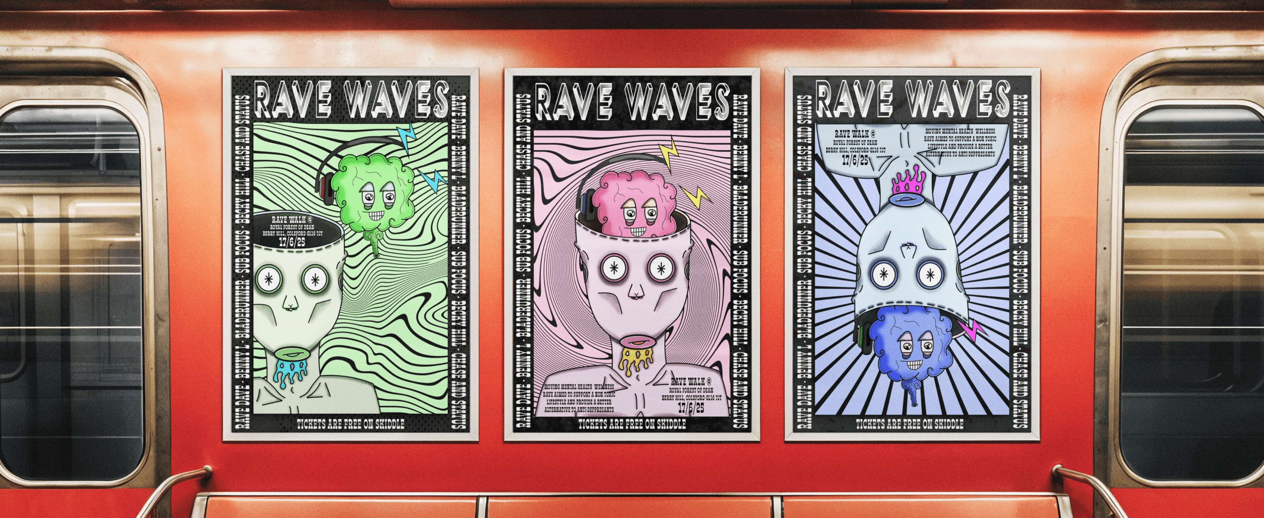
Sell The Unsellable
The Sell the Unsellable brief was about taking something that is easily accessible and turning it into something that can be desired and worth paying money for.
My insight was to sell a less chemical life based on the idea that antidepressants and medication are just thrown at society to help, when in reality there are many other methods and alternative medications that people could benefit from without the adverse side effects that can change the behaviours and dull the majority of emotions. I decided to promote this idea through a moving wellness music event that takes place throughout country parks. The aim would be to attend the event enjoying a community of like-minded people, great music and a leisurely walk through nature.
Gallery


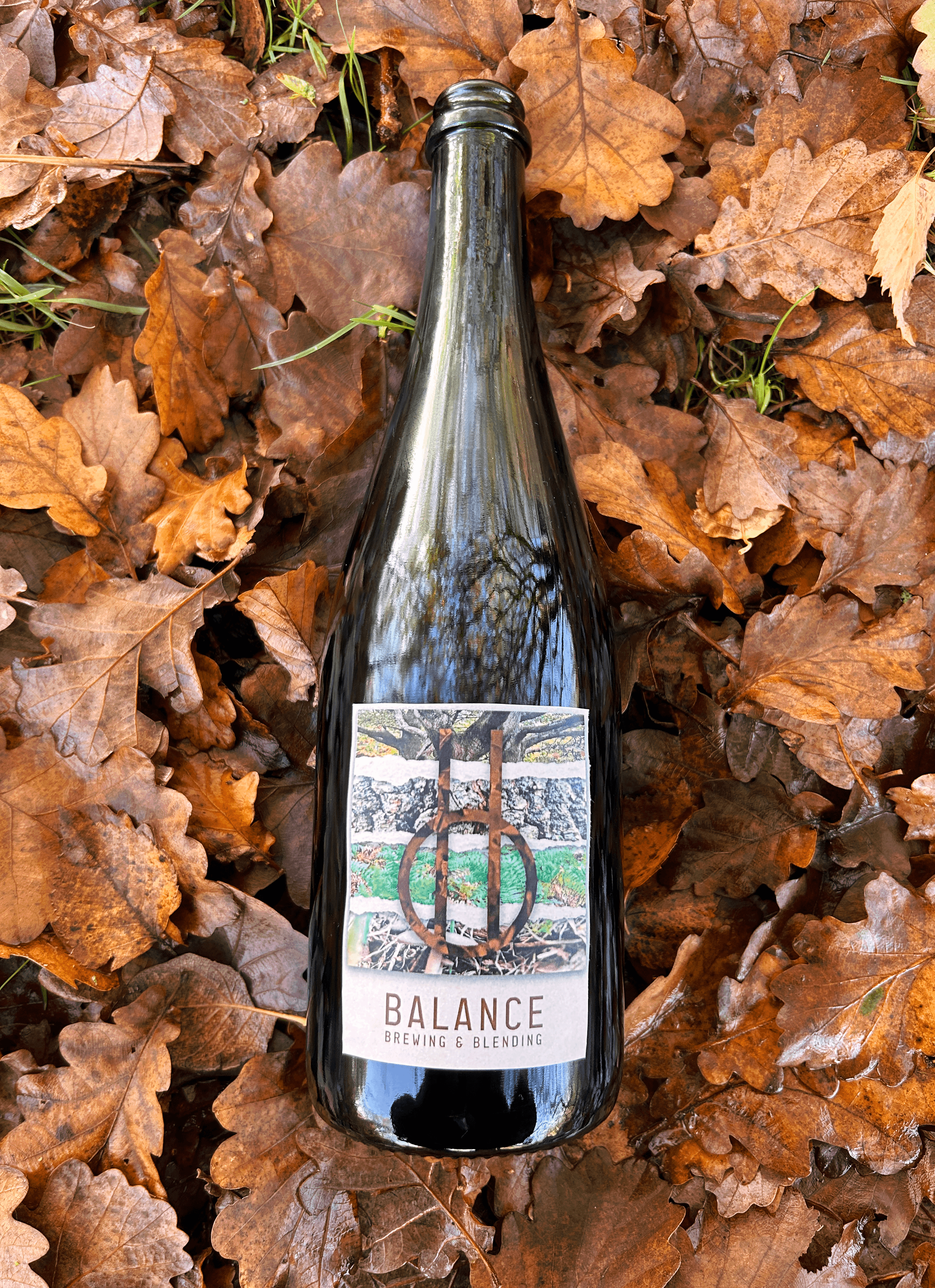
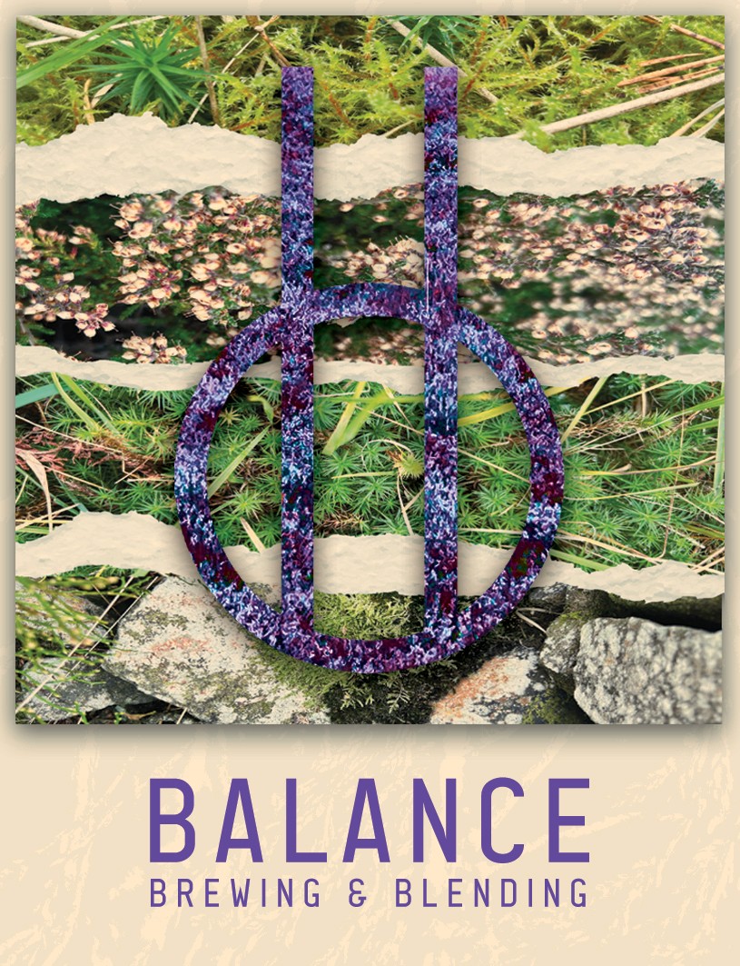
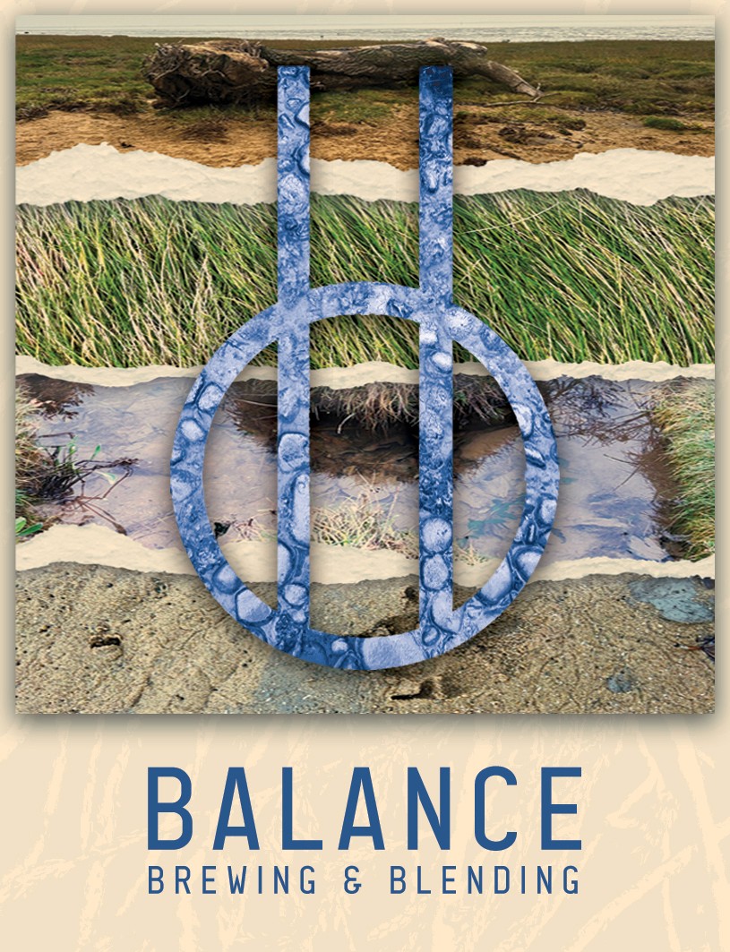
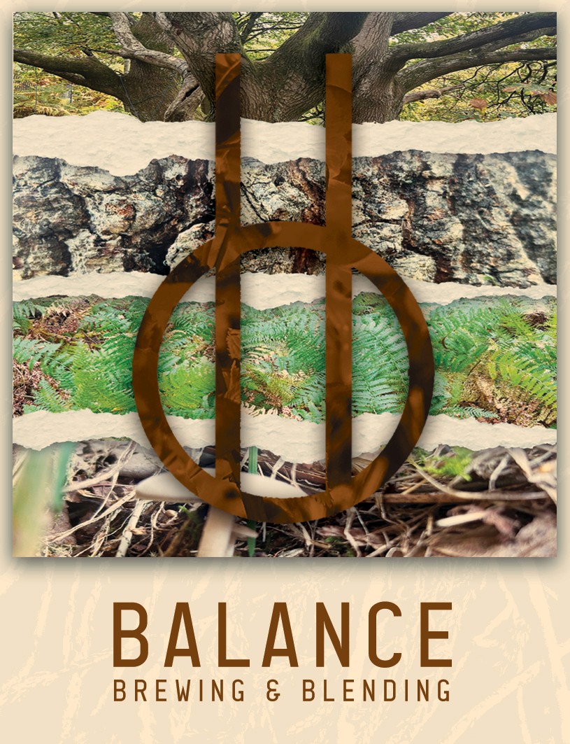
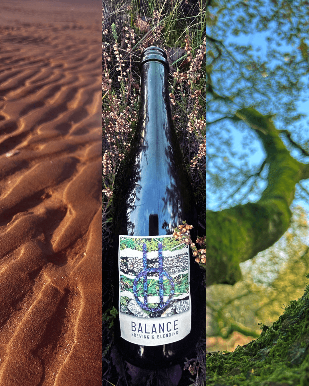


This brief was delivered to me by Balance Brewing and Blending, with the aim to create visual identities for three new flavoured products inspired by the Moorlands, Seaside and Woodland areas, as many of the ingredients used in these new flavours have been foraged from these local environments.
My Response to this brief was to research each environment by exploring the landscapes first hand, aiming to forage some of my own ingredients as well as photographing the areas. Whilst on my Adventures I found myself inspired by the layers within each environment, from the soil to the tops of the trees. I also explored creating the profiles of the landscapes using torn paper to help represent the hills and valleys of each area.
Explore - Balance Brewery
Gallery
D&AD WarChild secret 7
War Child Secret 7” was a brief presented by D&AD With the aim of creating an anonymous seven inch vinyl cover for one of seven tracks provided. The cover needed to be anonymous as the chosen cover was to be auctioned off.
My Chosen track was Warsong by The Cure as im familiar with some of their other music. I decided to depict This song through a drawing of a bomb in a bottle as from a media perspective war seems like a contained thing in today's society.
I then decided to further this by recreating my drawing using an actual bottle to create the look that the bombs in the bottle as well as giving great textures from the light refracting through the glass.
Following this I reflected on some of my research where I decided to implement a shattered clay mask as a response to the idea that through media war seems contained when in reality it is a matter that effects the masses regardless.
The Taste brief was about depicting specific tastes such as sweet or sour through visual methods. I chose to depict a sour taste through the means of a cake by using colours such as greens and blues which are typically the colours of sour sweets. I also decided to create some yellow sugar glass and smash it so that I could use the sharp and jagged edges of the glass to help emphasize the sharpness that comes with sour tasting things.
Taste
Skinny Pelembe Pt2
This project was an added deliverable to the Skinny Pelembe project where I was asked to zoom in on one track from the album and create the album artwork for it as well as the packaging.
From listening to the track I got the sense that this was a more emotional track and reminded me of some difficult relationships in the past.
Based on this insight I created imagery that depicted a fairy tale castle with the reverse side of the cover being a darker alternative version creating a contrast between the good and the bad sides of a relationship.
Sell The Unsellable
The Sell the Unsellable brief was about taking something that is easily accessible and turning it into something that can be desired and worth paying money for.
My insight was to sell a less chemical life based on the idea that antidepressants and medication are just thrown at society to help, when in reality there are many other methods and alternative medications that people could benefit from without the adverse side effects that can change the behaviours and dull the majority of emotions. I decided to promote this idea through a moving wellness music event that takes place throughout country parks. The aim would be to attend the event enjoying a community of like-minded people, great music and a leisurely walk through nature.
Explore - Balance Brewery
My Response to this brief was to research each environment by exploring the landscapes first hand, aiming to forage some of my own ingredients as well as photographing the areas. Whilst on my Adventures I found myself inspired by the layers within each environment, from the soil to the tops of the trees. I also explored creating the profiles of the landscapes using torn paper to help represent the hills and valleys of each area.
This brief was delivered to me by Balance Brewing and Blending, with the aim to create visual identities for three new flavoured products inspired by the Moorlands, Seaside and Woodland areas, as many of the ingredients used in these new flavours have been foraged from these local environments.
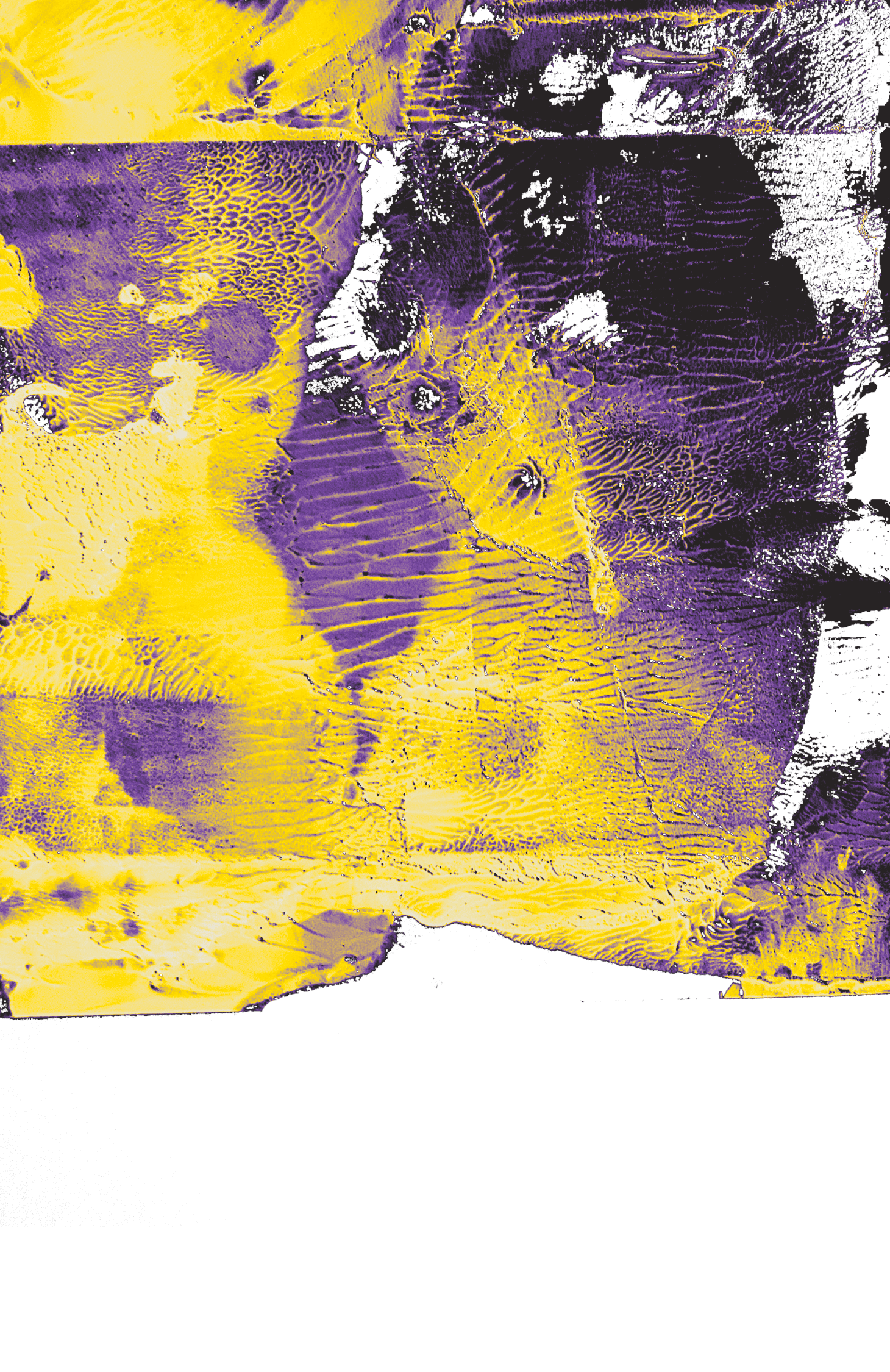
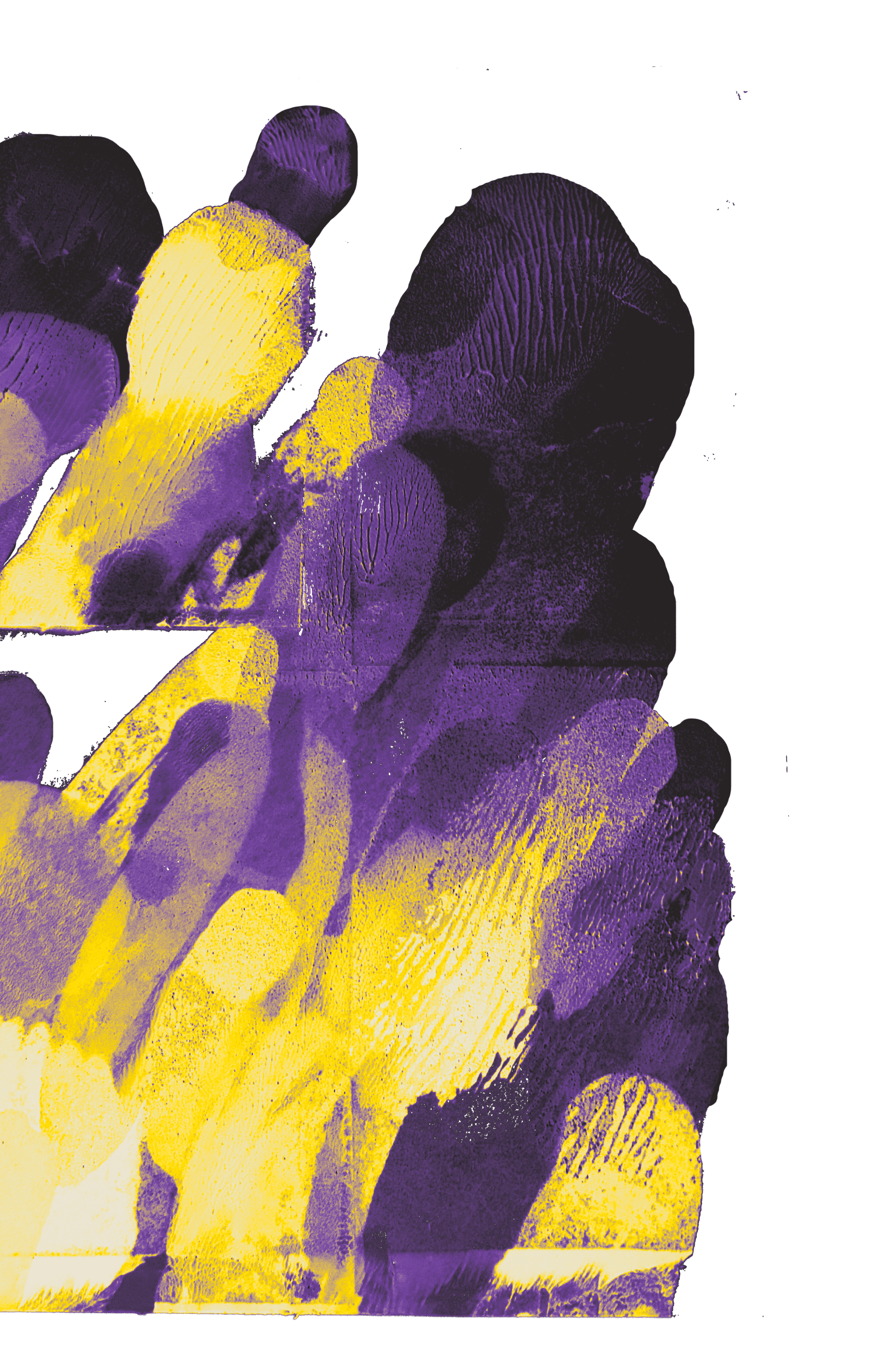
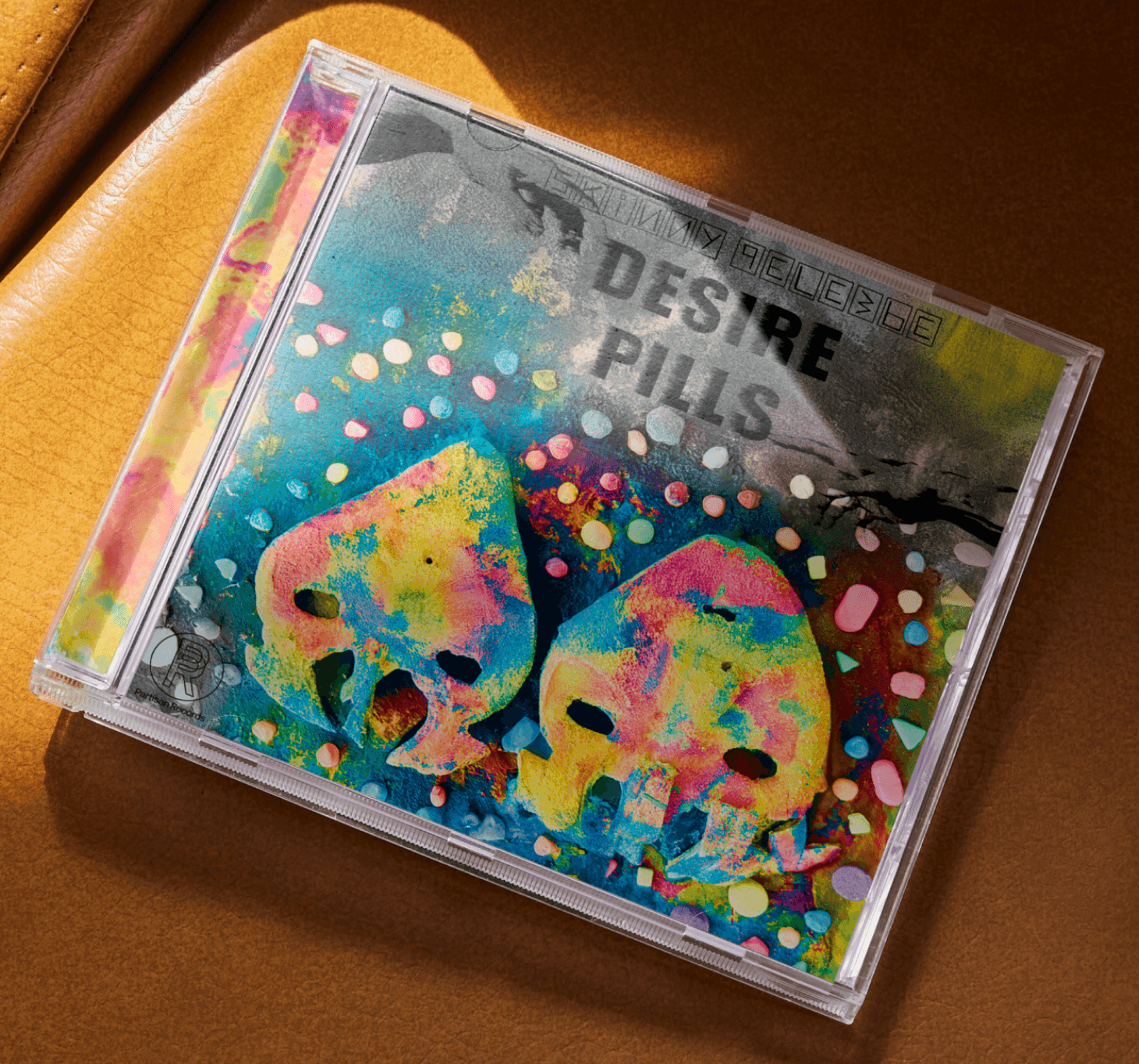
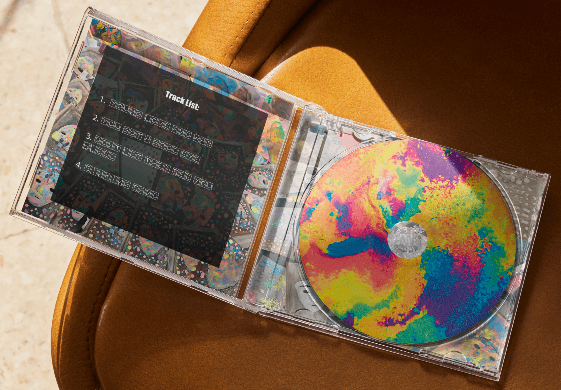
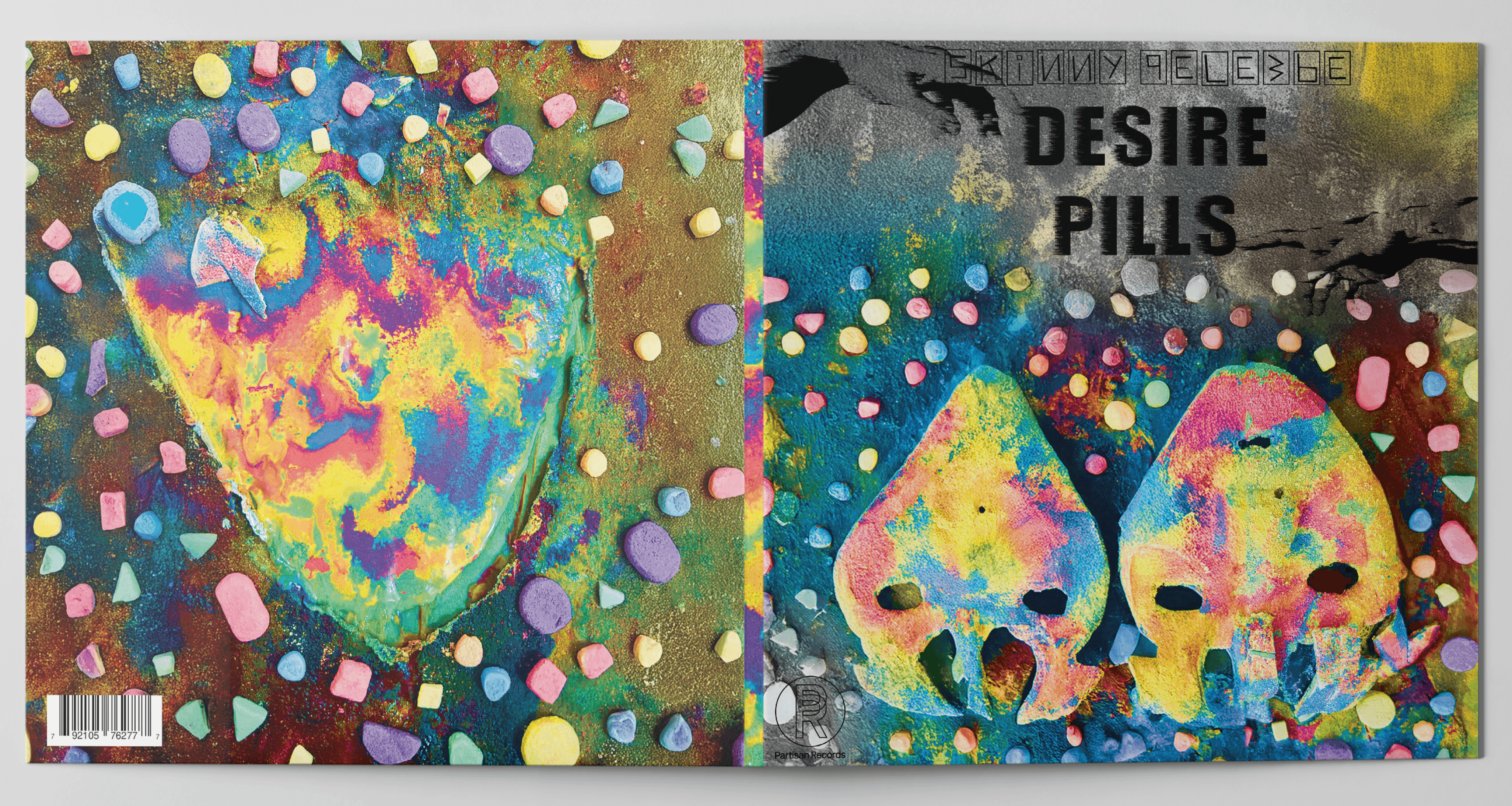
This Project was brought to me by Skinny Pelembe with the aim to produce a series of visuals in response to the music, artist and lyrics. Some of the deliverables included were a typographic identity for the artist, to design and artwork an album cover, the packaging for said album and to design a set of relevant communications to promote the album.
Through conversations with Skinny Pelembe we came to the conclusion that he wanted the album to reflect his Mozambique heritage since he had recently been on a trip there to reconnect, as well as informing me that the working title is Desire Pills.
Following this I listened to some tracks that were to be on the album which gave me a sombre Psychedelic feel. This audibly linked to the album title. Using these insights I chose to mix Psychedelia with traditional Mozambique masks, focusing on vibrant colours and textures that intertwined with each other creating a gentle yet bold and vivid Visual.
Desire Pills - Skinny Pelembe
Gallery
Desire Pills - Skinny Pelembe
This Project was brought to me by Skinny Pelembe with the aim to produce a series of visuals in response to the music, artist and lyrics. Some of the deliverables included were a typographic identity for the artist, to design and artwork an album cover, the packaging for said album and to design a set of relevant communications to promote the album.
Through conversations with Skinny Pelembe we came to the conclusion that he wanted the album to reflect his Mozambique heritage since he had recently been on a trip there to reconnect, as well as informing me that the working title is Desire Pills.
Following this I listened to some tracks that were to be on the album which gave me a sombre Psychedelic feel. This audibly linked to the album title. Using these insights I chose to mix Psychedelia with traditional Mozambique masks, focusing on vibrant colours and textures that intertwined with each other creating a gentle yet bold and vivid Visual.
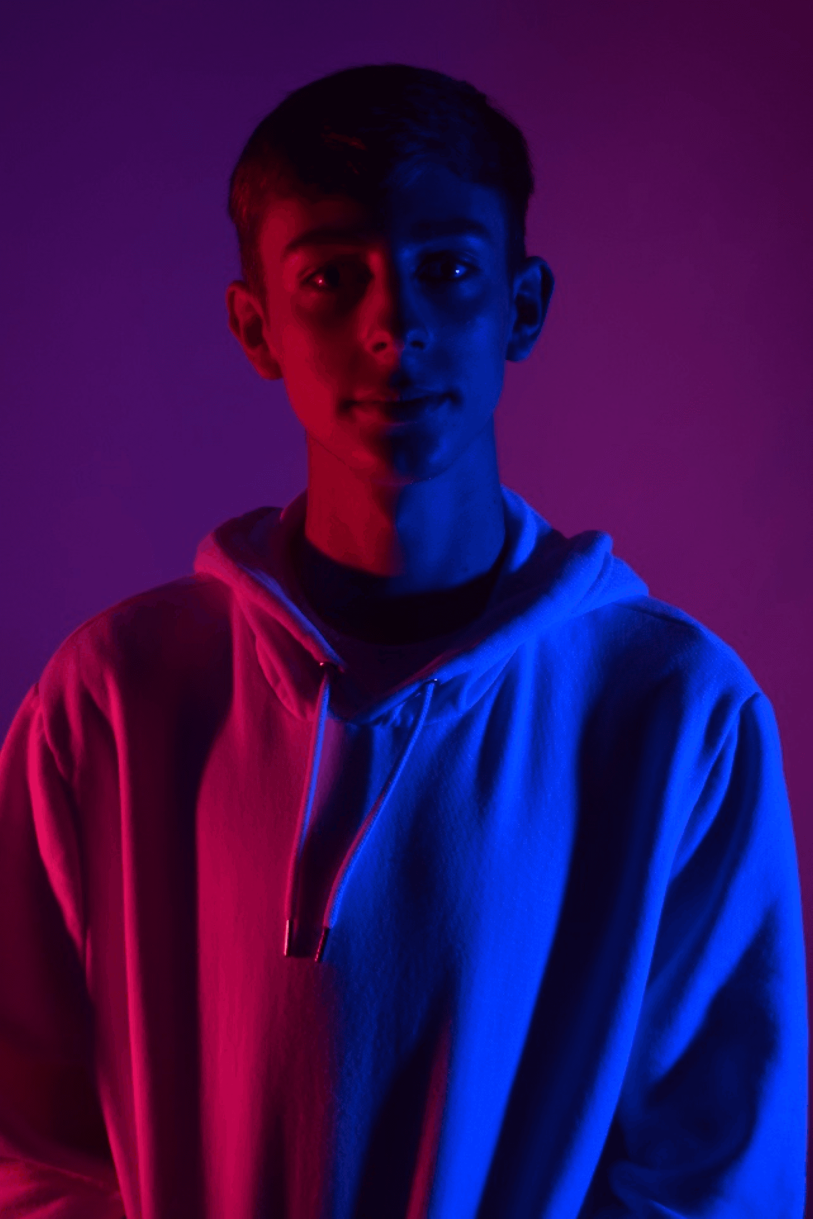
Who am I?
My Name is Jack Birchall I am a graphic designer who works where sound meets colour—where music spills beyond speakers and becomes something you can see, feel, and almost touch. My practice lives in the bold and the vibrant: saturated palettes, textured surfaces, and marks that wander, scratch, dance, and collide.
Within the music industry, I shape identities and packaging that carry the pulse of the artists behind them—visual worlds built from experimental craft, layered imagery, and tactile exploration. Each piece begins as an instinct, a gesture, a streak of colour, growing into design that hums with energy and emotion.
I create work that celebrates imperfection, embraces texture, and transforms music into vivid, handcrafted experiences—art that doesn’t just accompany sound, but amplifies it, expands it, and gives it a life entirely of its own.
Contact Information:
Email: jb48315@gmail.com
Instagram: jack._.Birchall
Telephone: 07549319008
Get in touch using the form or drop me a line at the contact information above.
Look forward to hearing from you!
About Me